
Overview
The National Wellness Institute (NWI) is an organization founded in 1977 with a mission to provide resources and services to health promotion and wellness professionals for their personal and professional growth. NWI offers certification and training for wellness professionals but has faced challenges adapting to technology, resulting in a decline in memberships. To revitalize their offerings, NWI aims to create digital wellness tools for wellness coaches and update their visual identity to reflect a more innovative approach to wellness. They encourage designers to develop solutions that promote personal well-being, require progress tracking, and maintain a fresh user interface.
When I initiated this project, we were in the midst of the COVID-19 pandemic. Driven by deep concern for the mental well-being of individuals affected by the pandemic, I made the decision to work on a Mental Health application, specifically focusing on a psychiatric and behavioral modification assistance application. To ensure a user-centric and effective approach, I adopted the Design Thinking methodology as a guiding framework for this endeavor.
Market research
To enhance my understanding of existing mental health applications, I first started by gathering expert opinions:
"I see mental health apps being very useful for people who cannot get to sessions as often as they would like, but I do not view them as a substitue for therapy."
"The apps also allow for privacy & confidentiality & can be a safe space for individuals who may be too ashamed to admit their mental health issues in person or who may feel that they will be negatively labeled or stigmatized by others."
"The ideal app will also have mental health practitioners onboard, ready to answer questions, plus a 24/7 support hotline for more severe cases."
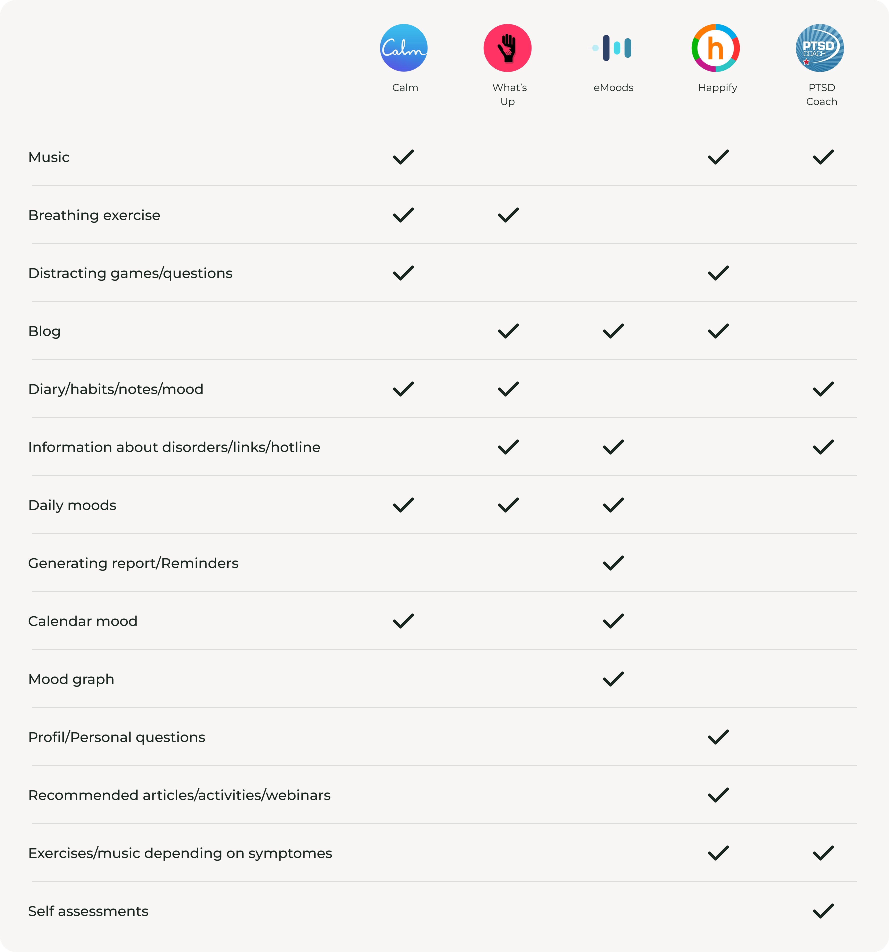
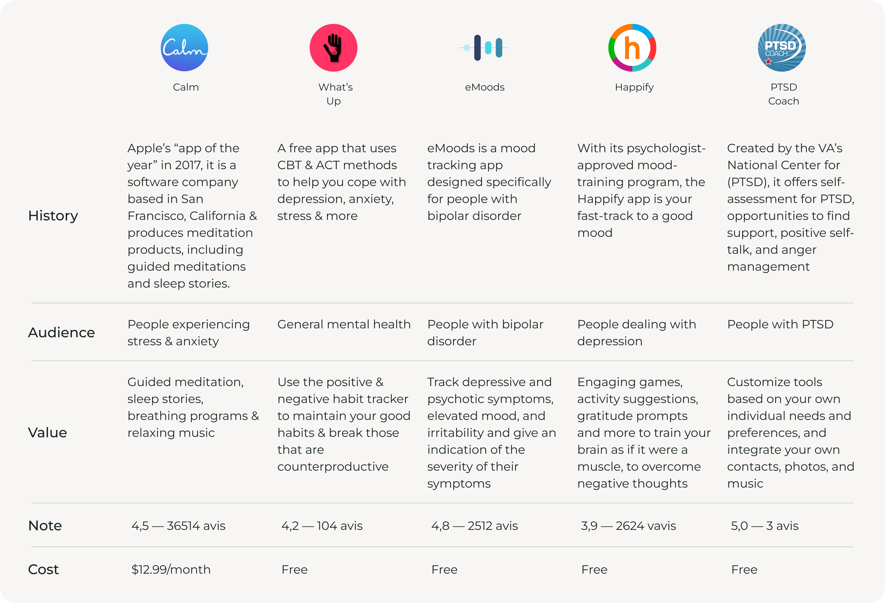
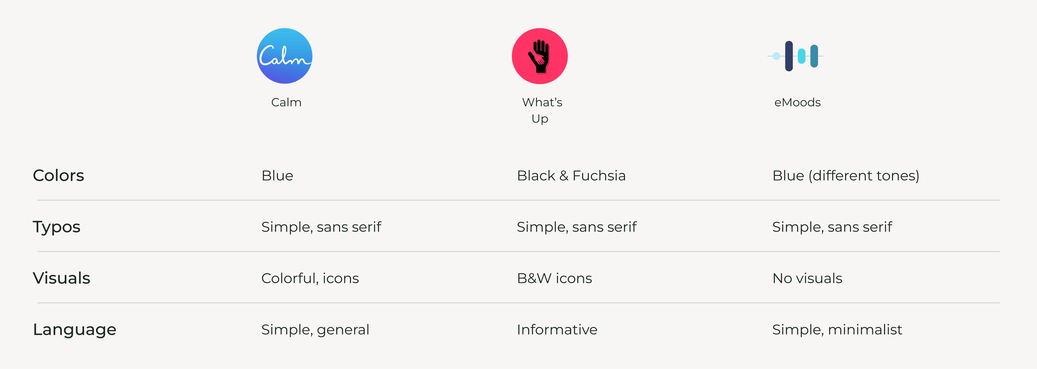
Then, I searched for existing mental health applications and selected five for in-depth analysis: Calm, What's Up, eMoods, Happify, and PTSD Coach. My initial objective was to analyze their features and services, leading to a competitor feature analysis. Subsequently, I decided to go even deeper and conduct a brand analysis.
Competitor feature analysis
Brand analysis
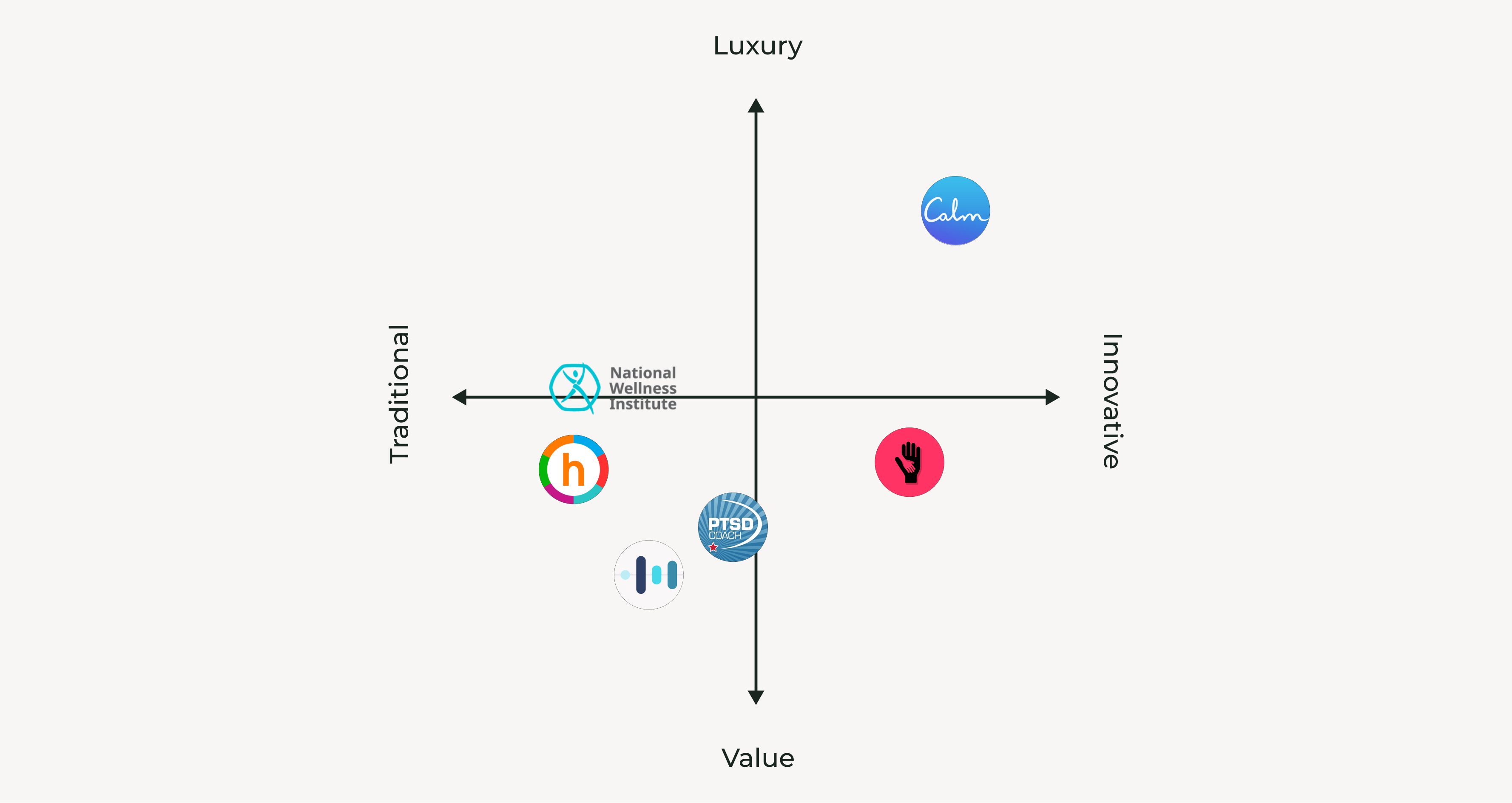
The brand analysis table aided in creating the Market Positioning chart and understanding NWI's position relative to competitors.
Market positioning chart
User research
After completing the Market Research phase, I conducted User Research. I began with an online survey to reach a wider audience and followed up with in-depth interviews with approximately 5 individuals.
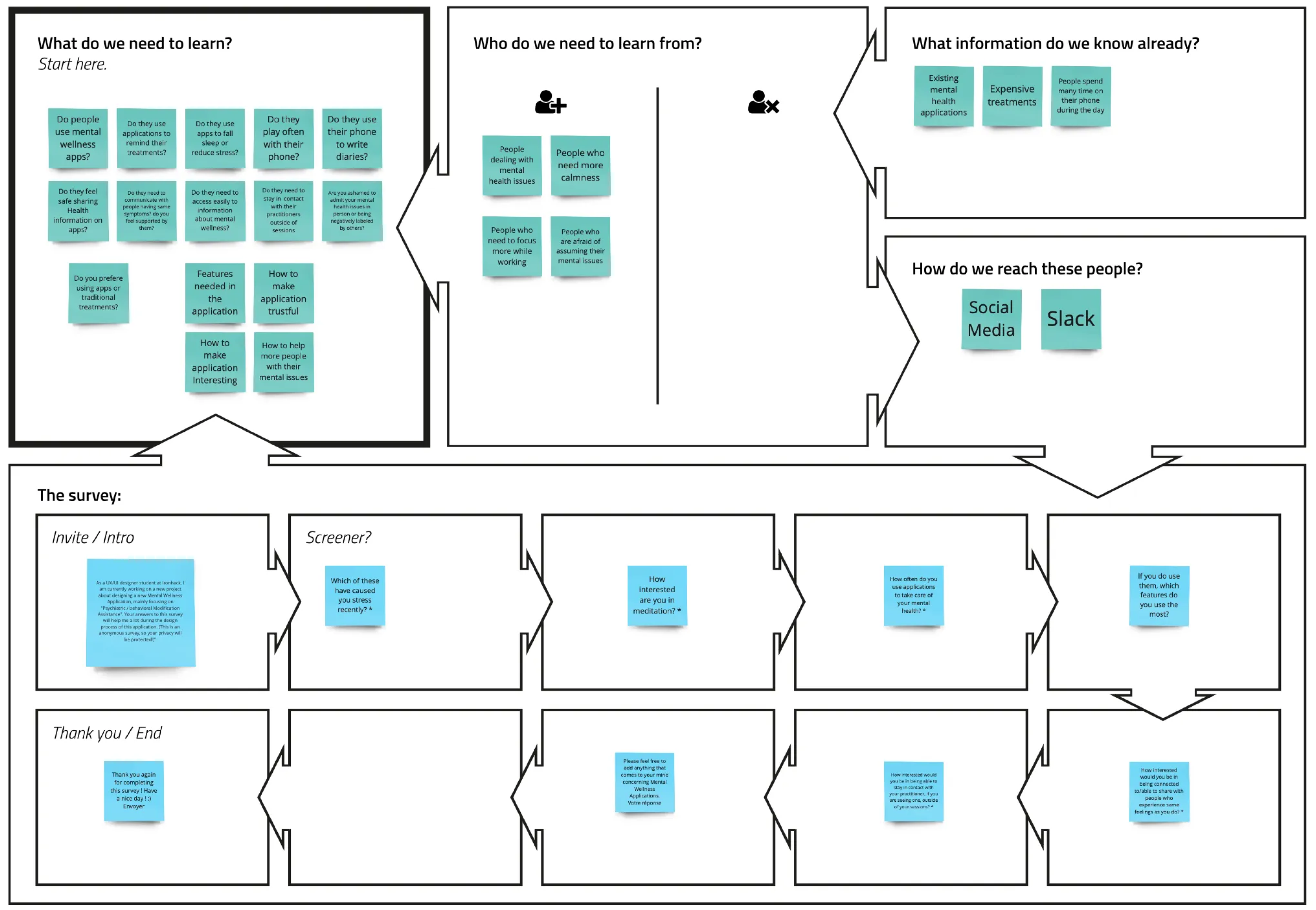
To prepare the survey, I used the Lean Survey Canvas, which helped me identify what I needed to learn, the target audience, and how to reach them. This guided me in formulating the questions I wanted to ask.
Lean Survey Canva
I send the survey online, and had about 19 responses from mostly women aged between 25 and 34.
I asked them about meditation, and most indicated a strong interest in practicing whenever they can or expressed a desire to practice more.
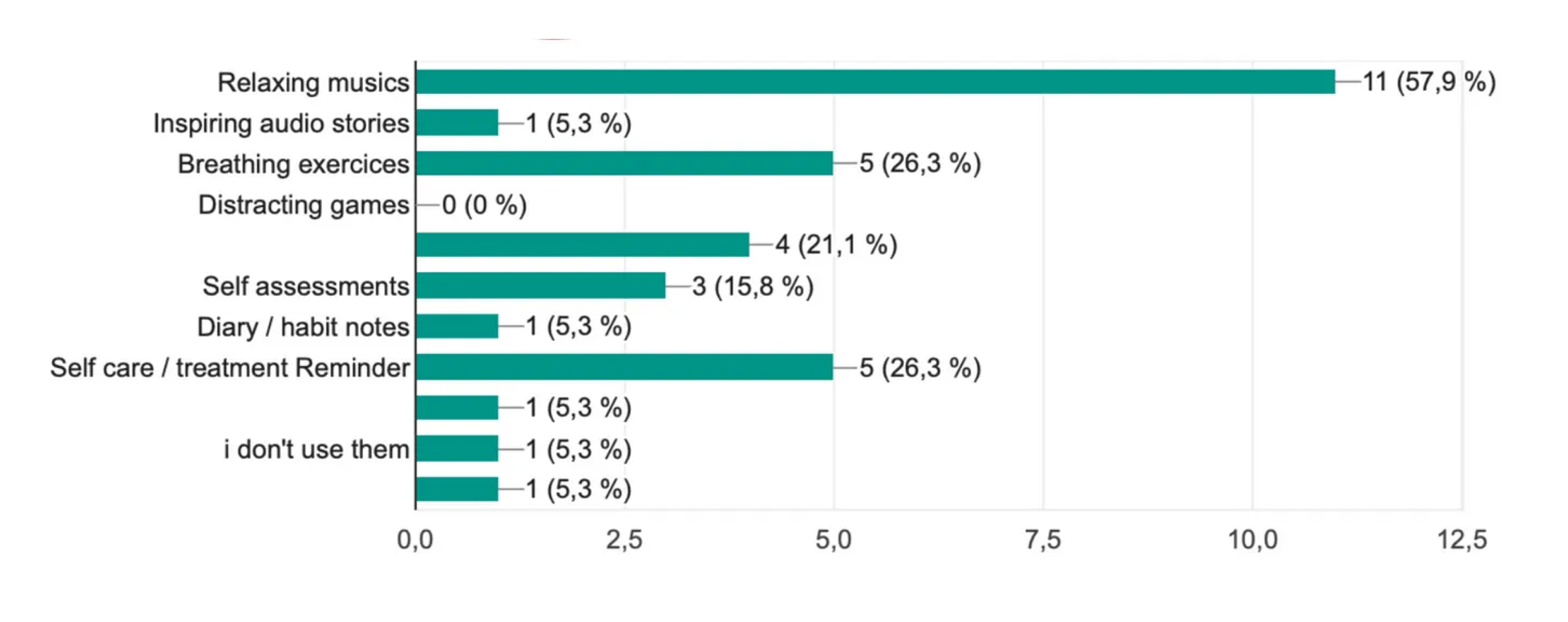
I also inquired about the mental health applications they use or have used and the features they find most valuable. Here are their choices:
Survey
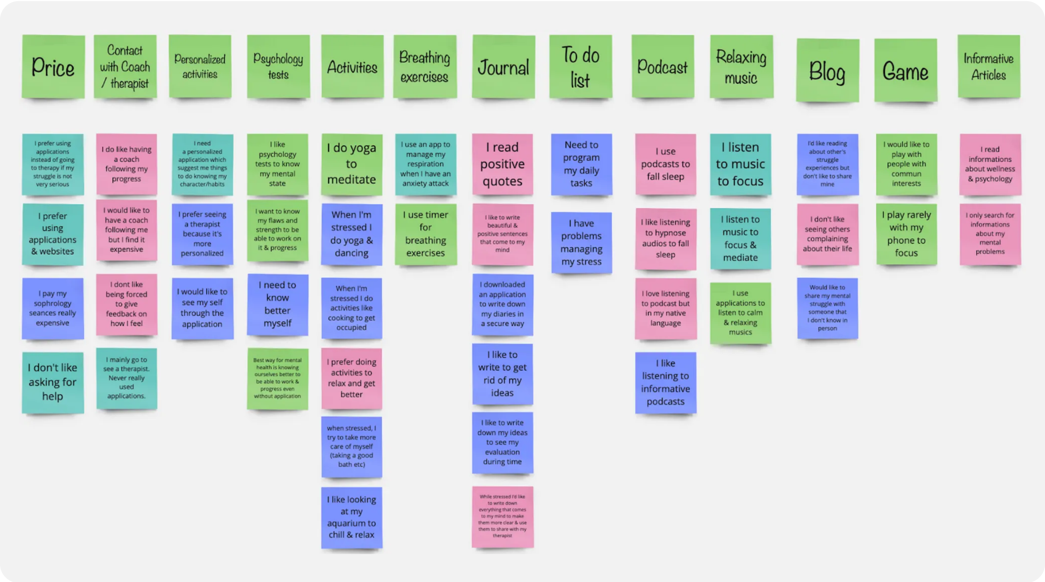
As for the interviews, I was lucky to engage in insightful discussions with five users. It became evident that users prefer applications with a friendly and personalized approach, as it makes them feel more assured and understood.
To capture the main points from these interviews, I documented them on sticky notes, allowing me to later group and organize them using an Affinity Map diagram. This method helped me identify key features to incorporate into my design.
Affinity Map
Define
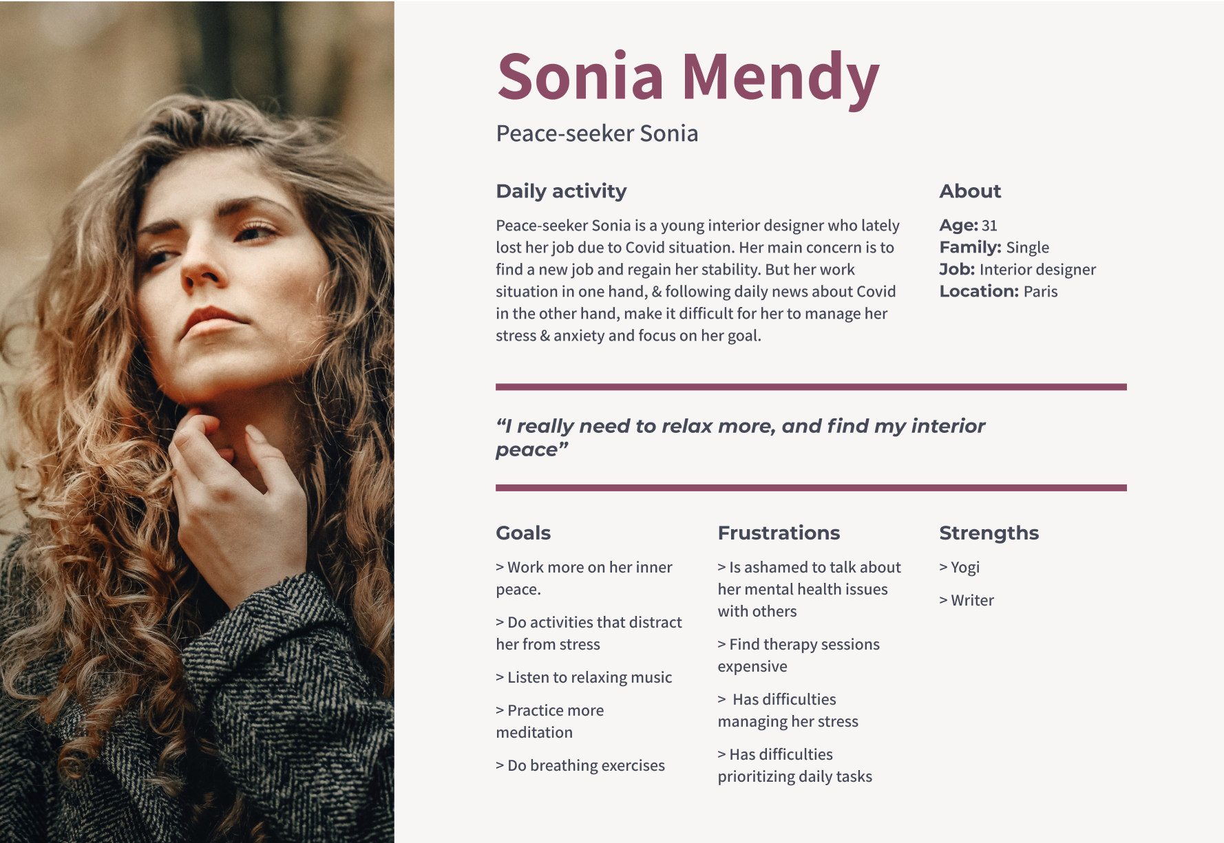
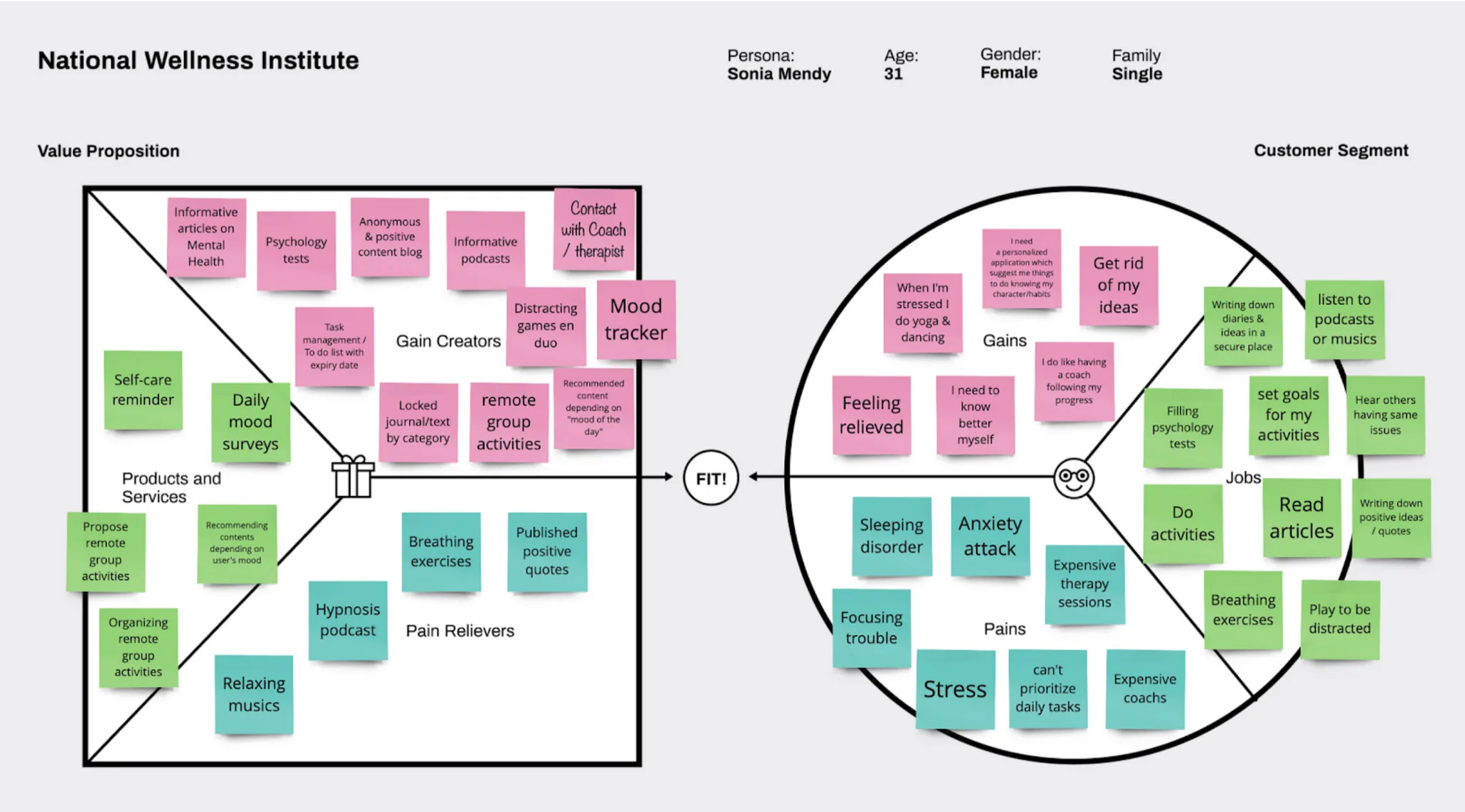
After studying the data collected from both the Market and User Research, the subsequent step involved crafting the primary persona: Sonia Mendy, the representation of the application's main user base, often characterized as peace-seekers.
Persona
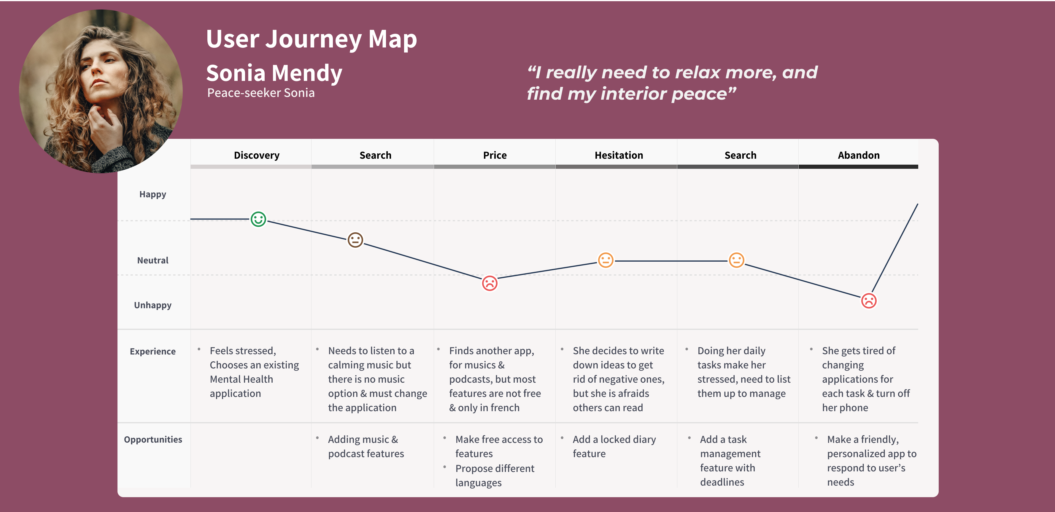
The creation of the persona, Sonia Mendy, guided me in developing a User Journey Map. I specifically concentrated on an "AS IS" journey map to identify the limitations of current Mental Health applications. It became evident that while there are numerous applications available, they tend to specialize in just a couple of main tasks. Users often find themselves switching between different apps based on their daily needs, which can be a source of frustration.
User Journey Map
Using the Persona and the User Journey Map as guides, I identified several tasks and objectives that users need to accomplish, which are represented as Jobs-To-Be-Done (JTBD):
"When feeling anxious with a busy mind I want to write down my thoughts and ideas in a secure place, so that I can eliminate negative thinking."
"When I am confused, I want to take psychology tests to better understand myself and my moods, so that I can manage them more effectively."
"When I'm overwhelmed with tasks and stressed, I want to set goals for my activities, so that I can better manage my stress level."
"When I feel stressed, I want to listen to relaxing music, so that I can calm down and regain focus."
"When I'm going to bed after an exhausting day, I want to listen to hypnosis podcasts, so that I can fall asleep easily & deeply."
"When I'm stressed, I want to engage in activities I enjoy, so that I can be distracted."
"When I'm stressed, I want to hear from others who are experiencing similar issues, so that I can gain perspective & feel reassured."
"When I experience an anxiety attack during a flight, I want to perform breathing exercises, so that I can calm down."
"When I'm dealing with mental health issues, I want to read informative articles, so that I can gain knowledge and better manage them."
Besides the Persona, I chose to employ the Value Proposition Canvas to comprehend the product's capabilities and gain a deeper insight into users, their environment, concerns, and aspirations. This canvas allowed me to develop a value proposition aligned with their expectations. It facilitated the incorporation of the previously identified JTBDs, enabled me to outline the product's features and services, and establish connections between the user's gains and pains and the application's benefits and solutions.
Value Proposition Canva
The next step involved creating various user stories, which are informal descriptions of software features written from the end user's perspective. I generated a comprehensive set of user stories and further developed them by adding associated acceptance criteria.
"As a peace-seeker, I want to manage my breathing, so that I can control my anxiety attack."
"As a peace-seeker, I want to access personalized content, so that I can feel understood and assured."
"As a peace-seeker, I want to be able to choose from various music/podcast categories, so that I can listen based on my mood."
"As a peace-seeker, I want to set deadlines for my daily tasks, so that I can improve stress management."
"As a peace-seeker, I want to write diaries securely so that I can ensure the privacy of my entries"
"As a peace-seeker, I want to learn how others overcome their mental struggles, so that I can relate to their experiences"
"As a peace-seeker, I want to gain better self-awareness and understanding of my struggles so that I can make them easier to manage"
"As a peace-seeker, I want to play with people who share common interests, so that I can be both distracted & supported."
"As a peace-seeker, I want to have an easy access to contact my therapist so that I can feel assured during mental health issues."
"As a peace-seeker, I want to access informative articles, so that I can learn more about my mental issues"
Through the steps I've outlined, I accumulated a substantial amount of information regarding the features I wished to incorporate into my mental health application. This led to the creation of multiple feature propositions, and to streamline their prioritization and decide which ones to design first, I opted to use the MoSCoW method.
Moscow method
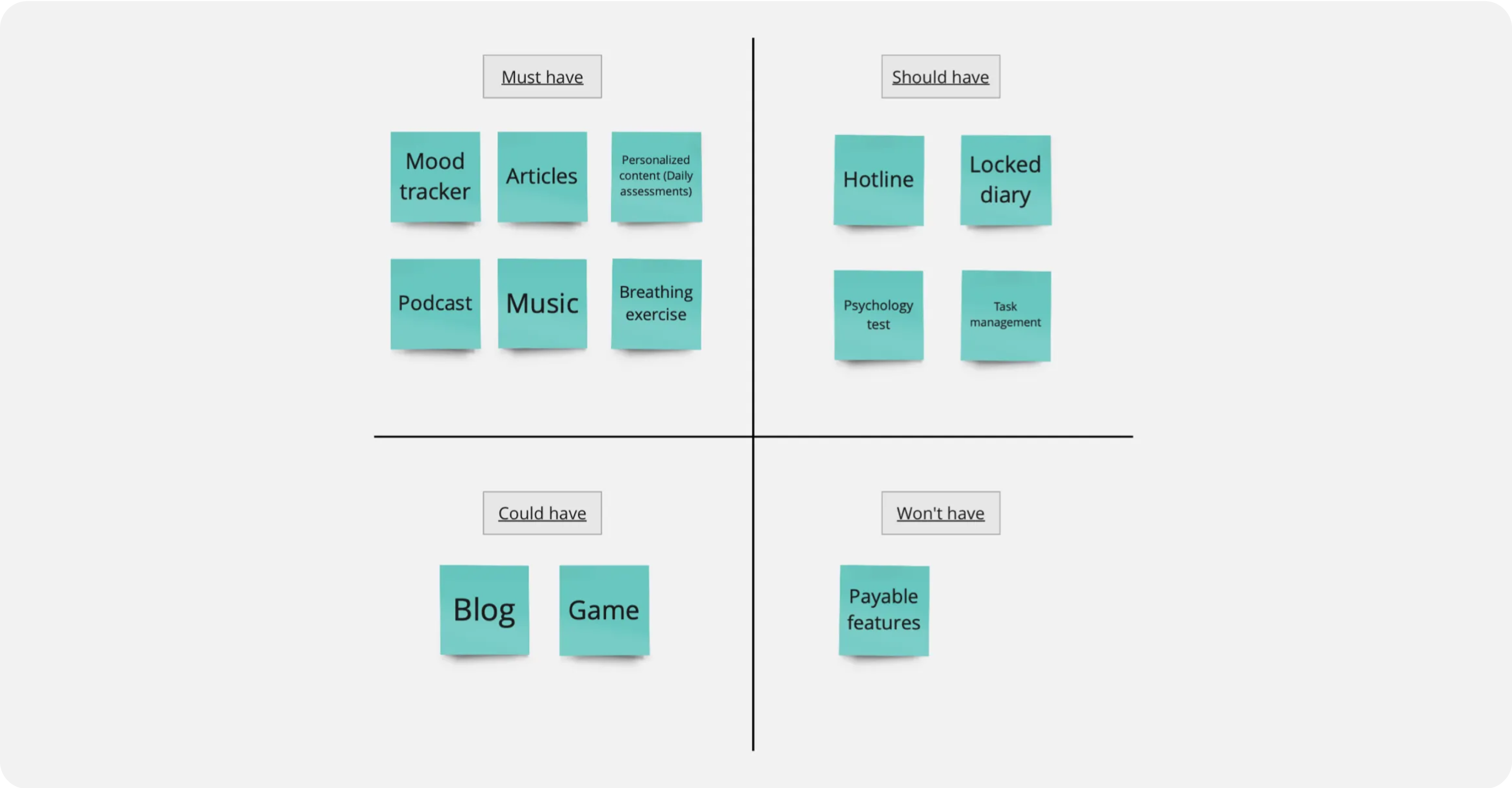
This process ultimately led me to define the Minimum Viable Product (MVP), which is a crucial step in determining the core features and functionalities that will be developed and released initially.
"Our application empowers users to enhance their mental health through mood and emotion tracking, and by offering personalized content recommendations."
With the features selected and the MVP defined, it was finally time to put all this information into practice.
Ideate
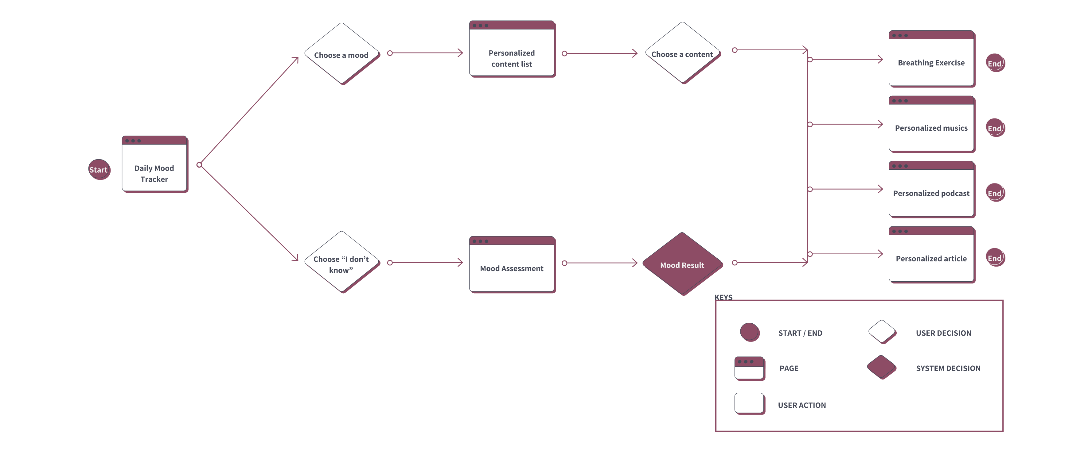
I began the design process by creating the User Flow with the following objective:
"Select your daily mood and complete a personalized activity."
User Flow
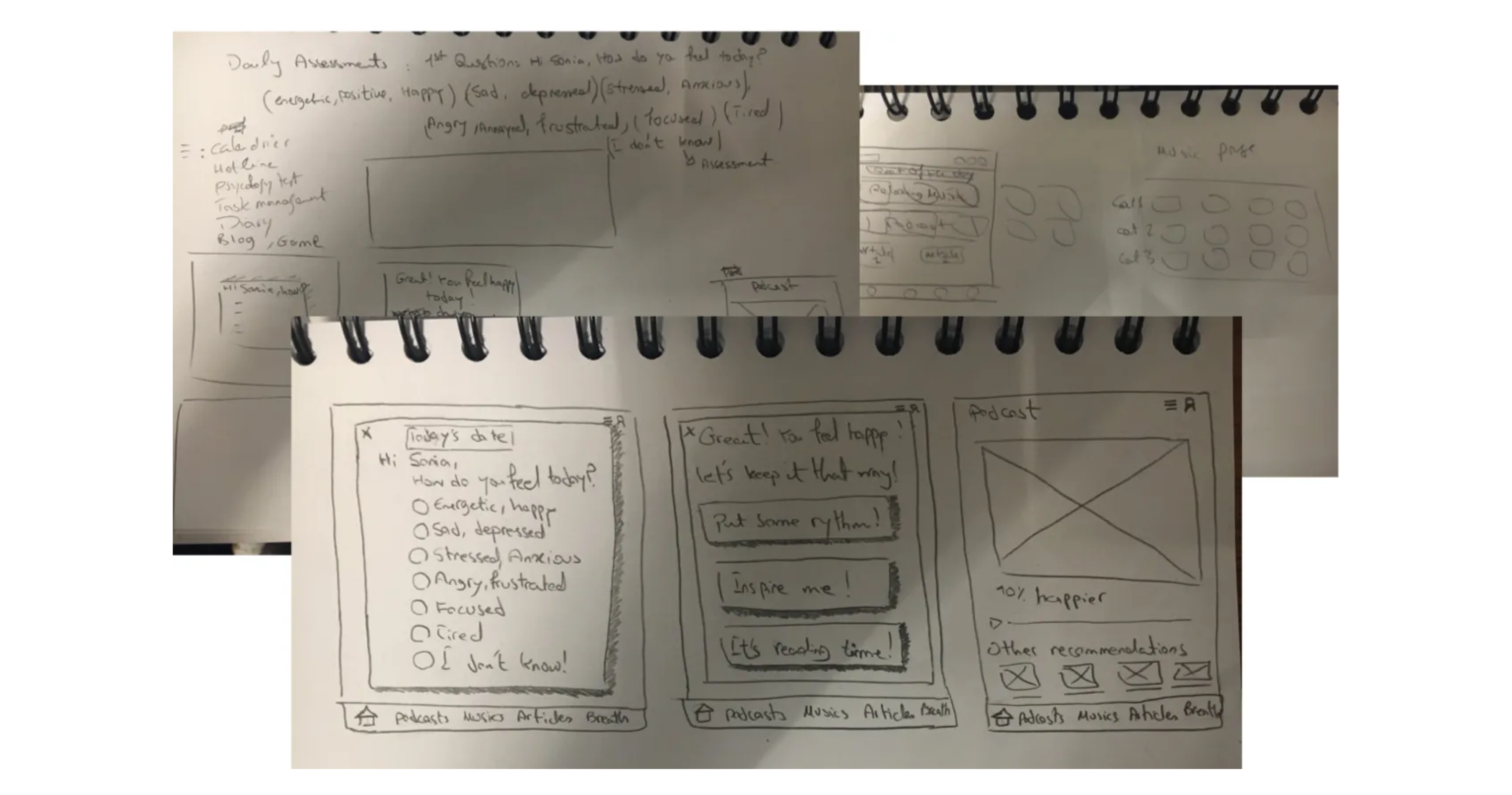
From there, I proceeded to sketch various screens for my user flow.
Wireframe sketch
Mid-Fi prototype & test
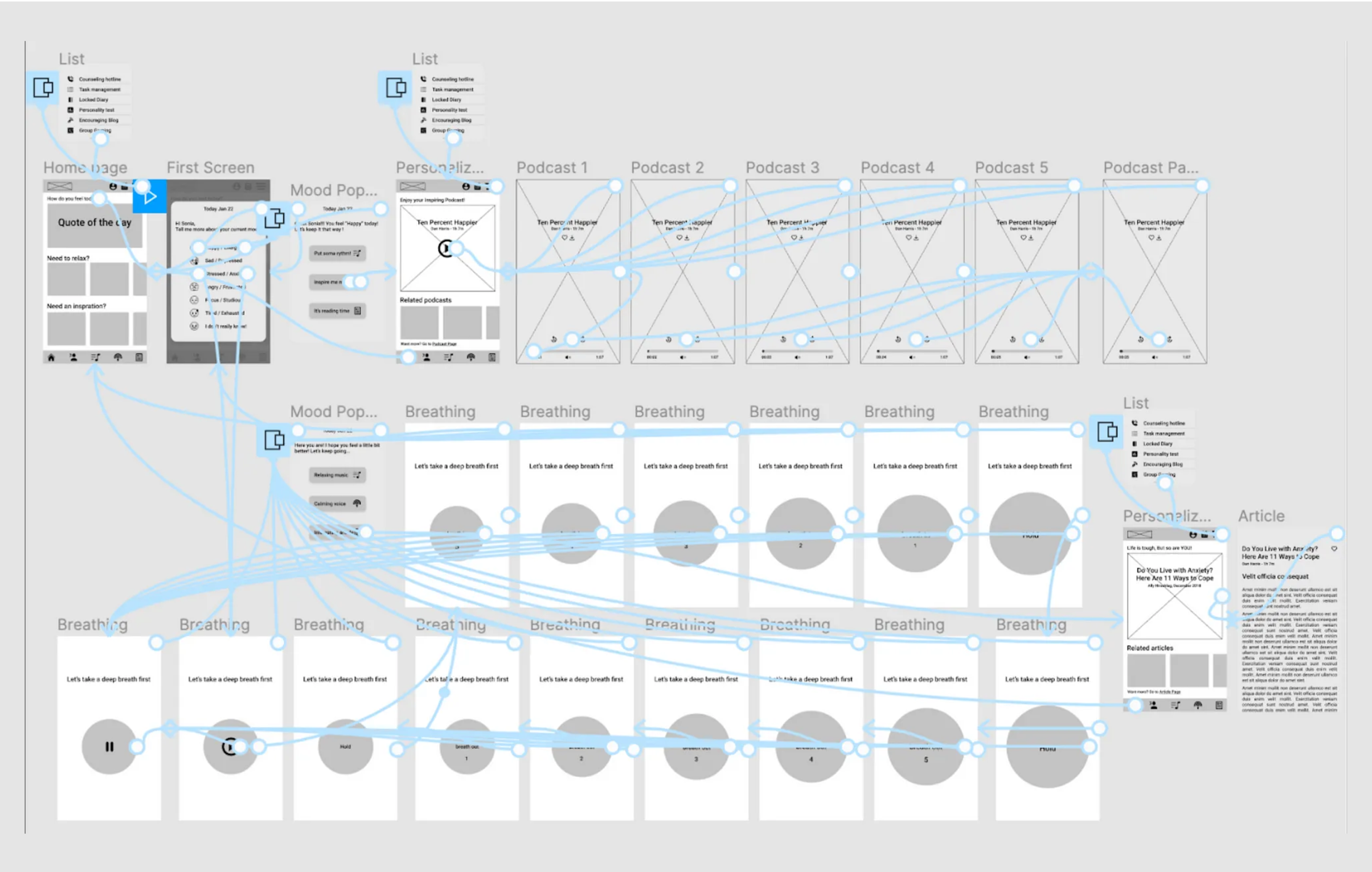
I used Figma to create my Mid-Fi prototype, and here's how it functions: When the user opens the application for the first time, they are greeted by a pop-up screen where they can select from various suggested moods for the day. Depending on their chosen mood, the application offers a range of activities such as personalized podcasts, articles, or music.
In the event the user is feeling stressed, the application prioritizes calming them down. It offers a breathing exercise to help them relax, and once the user feels calmer, they can then choose from a selection of personalized activities.
Mid-Fi prototype
To ensure I was on the right track and to identify any potential design flaws, I conducted usability testing on my prototype. I used Maze for the usability tests and also conducted live tests with various users.
Usability test
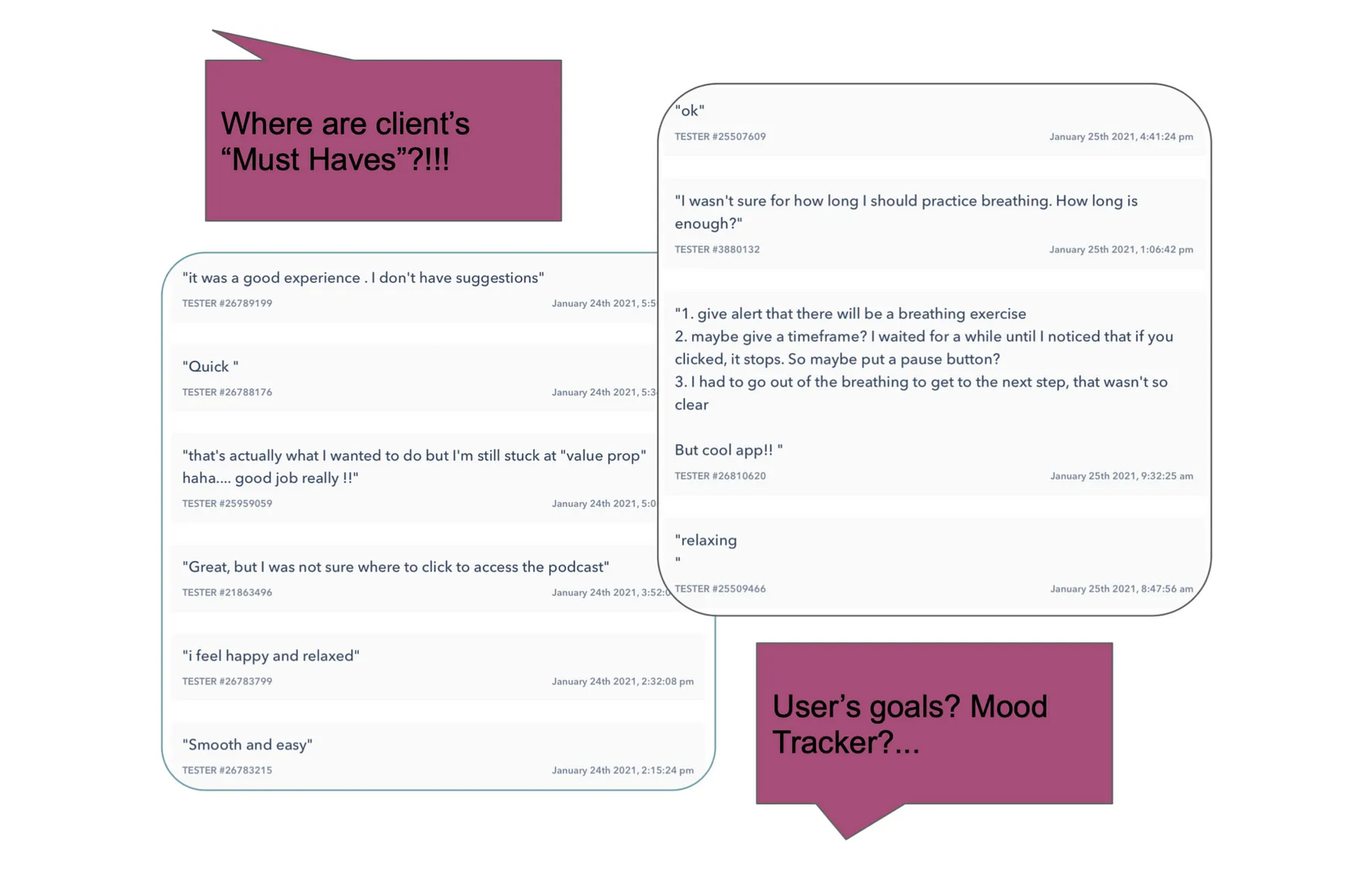
During usability testing, most users felt at ease with the prototype. However, some users had difficulty understanding how to end the breathing exercise.
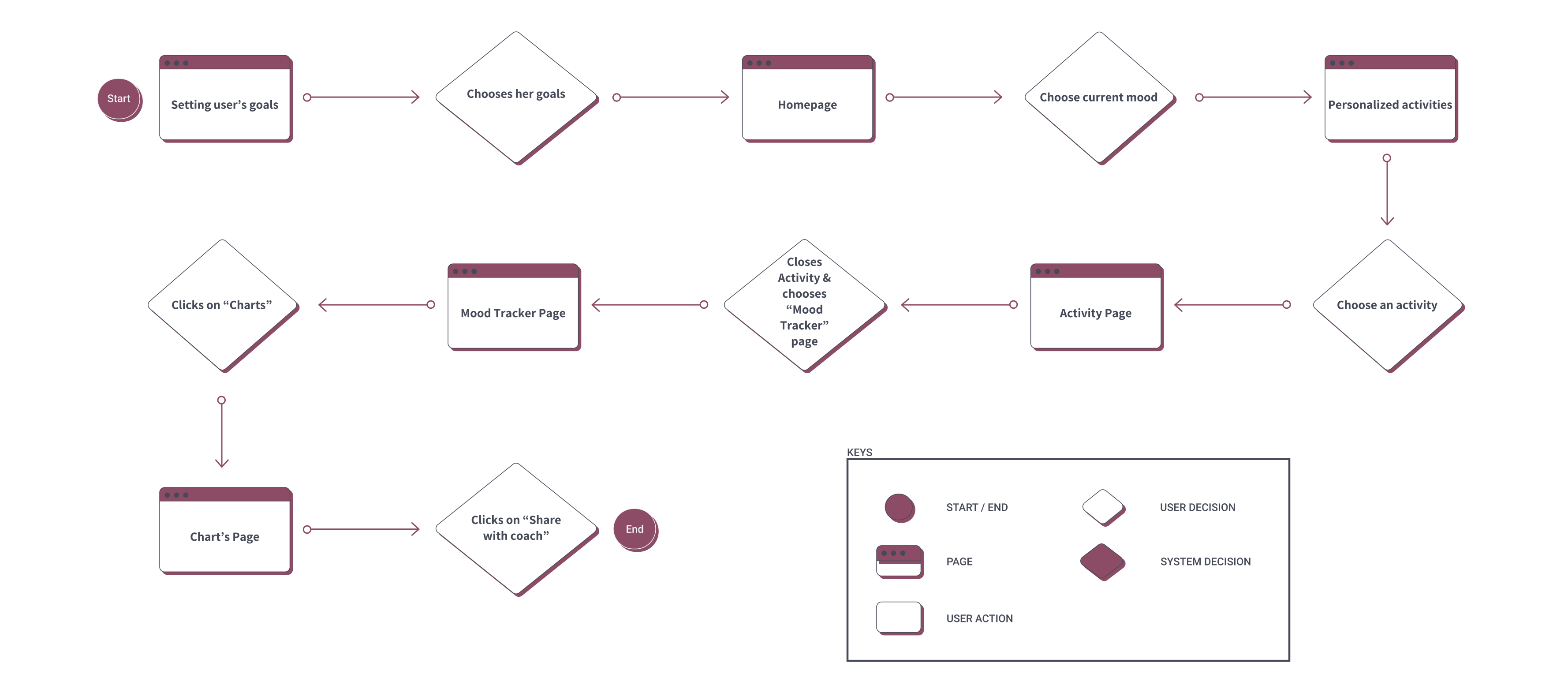
Additionally, I realized that I had overlooked the client's fundamental requirement in the initial user flow, which was to track the user's progress and facilitate communication with a coach. Fortunately, the iterative nature of the Design Thinking methodology allows us to test the design after each step and make necessary adjustments before progressing too far. This led me to develop a second User Flow:
User Flow-V2
My subsequent step involved enhancing my Mid-Fi prototype and constructing the Hi-Fi version, while considering the feedback from usability testing, incorporating the new user flow, and introducing a color scheme to the design.
Visual design
It was time to establish the color palette for my application, and I began by conducting a visual competitor analysis to better understand the typical visual choices made in similar applications.
Visual competitor analysis
I also researched the meanings of colors. According to color psychology, blue reduces stress and tension, but if dealing with frequent mood changes, it's advisable to avoid excessive use of blue. Yellow enhances memory and concentration, purple is associated with meditation and spirituality, pink uplifts mood and promotes happiness, and green is known for its stress-reducing and anti-depression qualities.
Given that the application is intended for mental health, I wanted it to convey a joyful, friendly, positive, and relaxing atmosphere to ensure users feel good while using it.
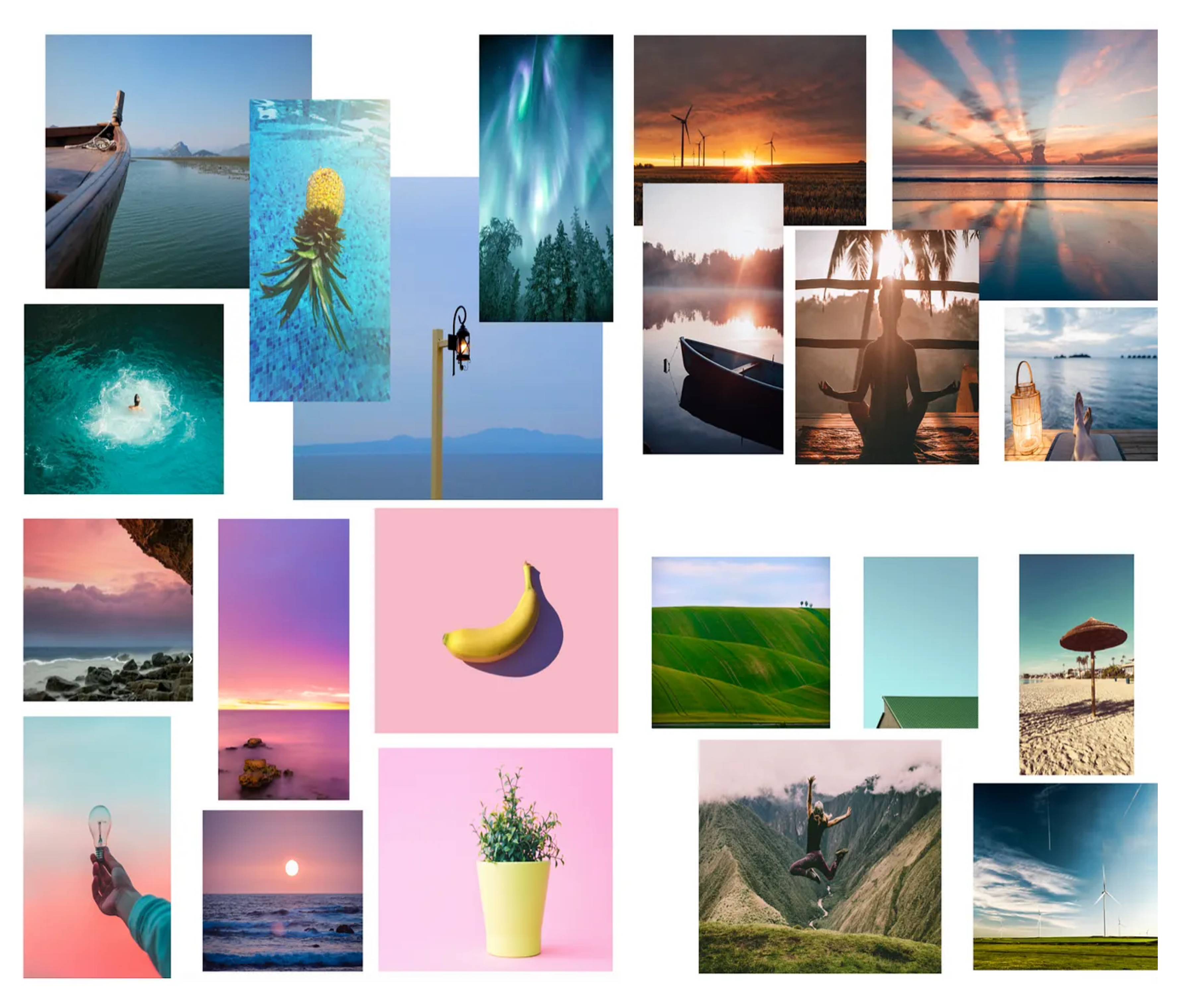
I created four distinct Mood Boards with colors that I believed would best reflect the desired adjectives. Subsequently, I conducted an online survey to assess these Mood Boards. The Purple mood board received the adjectives I was aiming for, as chosen by the majority of the participants.
Moodboard
Visual survey

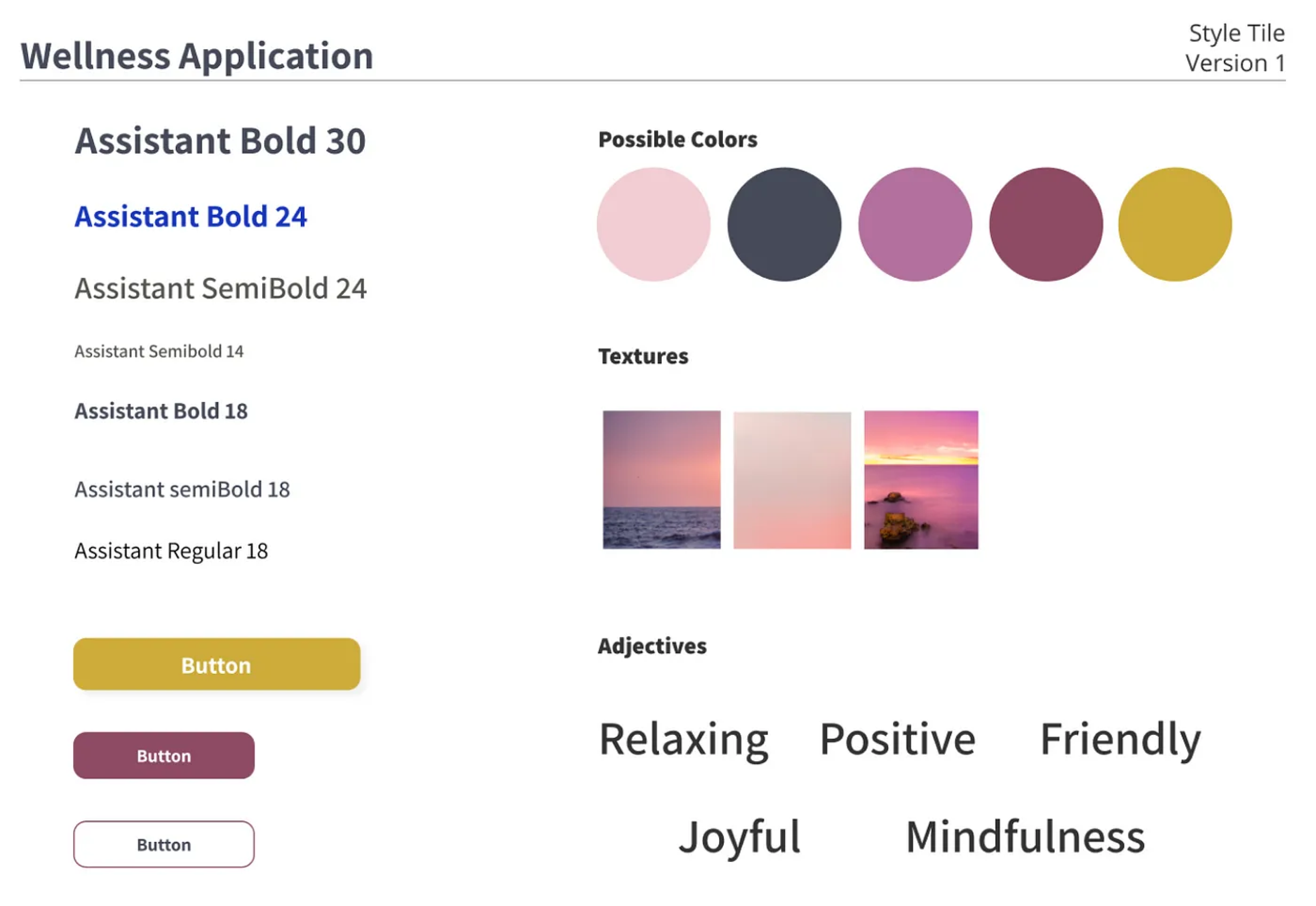
Building upon the previous steps, I've crafted the following Style Tile:
Style tile
Hi-Fi prototype
Here, you can view the Hi-Fi prototype of my mental health application. Let's explore it together!
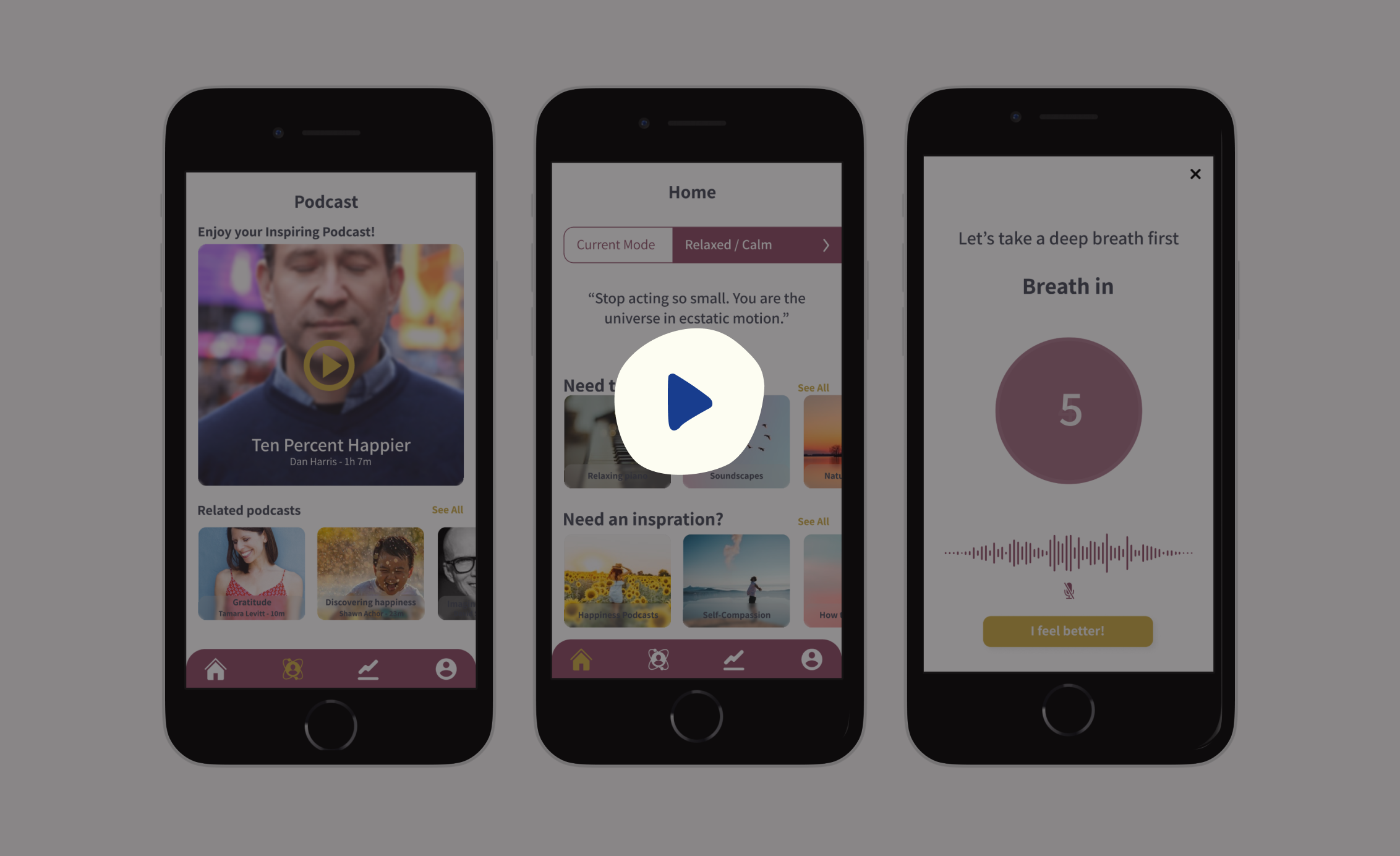
One of the significant changes I made in the Hi-Fi prototype compared to the Mid-Fi version was altering the initial question the application poses about the user's current feelings. During a user test, I received feedback that the selection of words like 'depression' or 'anger' made the user feel even more depressed. In response, I decided to revamp the entire question. Instead of inquiring about how they currently feel, the question now asks users how they would like to feel while using the application.
Conclusion
Over the course of this two-week project, I endeavored to design a motivating and user-friendly mental health application. Informed by the user research I conducted, I introduced various activities, such as a locked diary for users to freely express their thoughts without privacy concerns and group gaming to provide distraction and social engagement. The primary objective was to offer diverse activities, ensuring users wouldn't feel the frustration of switching between multiple applications for their various needs.
I also had the opportunity to experience the benefits of the Design Thinking methodology, which allowed me to make necessary adjustments during the project when I realized I had overlooked the initial client's need in favor of user needs. This iterative approach saved time and kept the project on track.
In the upcoming phases, I plan to conduct a desirability test to confirm my choice of colors for branding and continue testing with users to enhance the application further. I also have future plans to design the activity pages. Furthermore, a conversation with a friend who is a clinical psychologist provided me with additional ideas to address genuine needs. I'm excited about the prospect of meeting a developer who shares my concerns and collaborating to bring the complete application to fruition.