
Overview
Monkey Locky is a service that provides secure lockers for keys, available seven days a week in nearby shops. It's used by both travelers storing keys and landlords securely transferring keys to tenants.
As Monkey Locky evolves, it has entered partnerships with major entities like Carrefour and La Poste, with a current focus on automating its solution. Consequently, there is a crucial need to revamp the design of their website (V.3).
Their main challenge is that users find their subscription system confusing. They want to make things clearer and simplify how users interact with their service. The subscription is similar to a gym membership, where users can pay monthly or annually but need to reserve a locker each time they want to use it.
To tackle this challenge, my colleague and I planned to use the Design Thinking methodology. Our goal was to create a design that puts the user first, making the subscription system more straightforward and the overall experience easier for everyone. We also opted to adopt a mobile-first approach, prioritizing the mobile version to ensure a seamless and user-friendly experience for all.
Market research
We initiated our research by identifying direct competitors of Monkey Locky. Our primary objective was to gain a deeper understanding of their overall design aesthetics, brand personality, and core values.
Brand analysis
User research
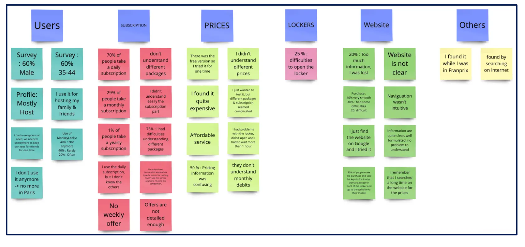
After completing the Market Research phase, we decided to send out a survey to Monkey Locky’s users and gather some quantitative datas about the difficulties they encounter while using the website. We used Lean Survey Canvas to prepare our questions.
Lean Survey Canva
By looking at the survey’s results, we could notice that most users have difficulties understanding different packages. And also, the pricing information seems confusing to them. We also had a message from a user who said that months after his reservation was over, he realized that he was still paying for the subscription and felt frustrated.
Survey
We wanted to deepen even more our understanding of the problematic by doing some interviews with the users. We chose about ten users randomly and started to call them. Most of them said that they use the service punctually so that they have never had a subscription problem, but they find that the information about the pricing and different packages on the website is not clear, and the subscription seems complicated to them.
User interview
We wrote down all the gathered information from previous steps on post-its and started to brainstorm using Affinity Map. It helped us organizing all those quantitative and qualitative data by putting them in different main groups.
Affinity map
Define
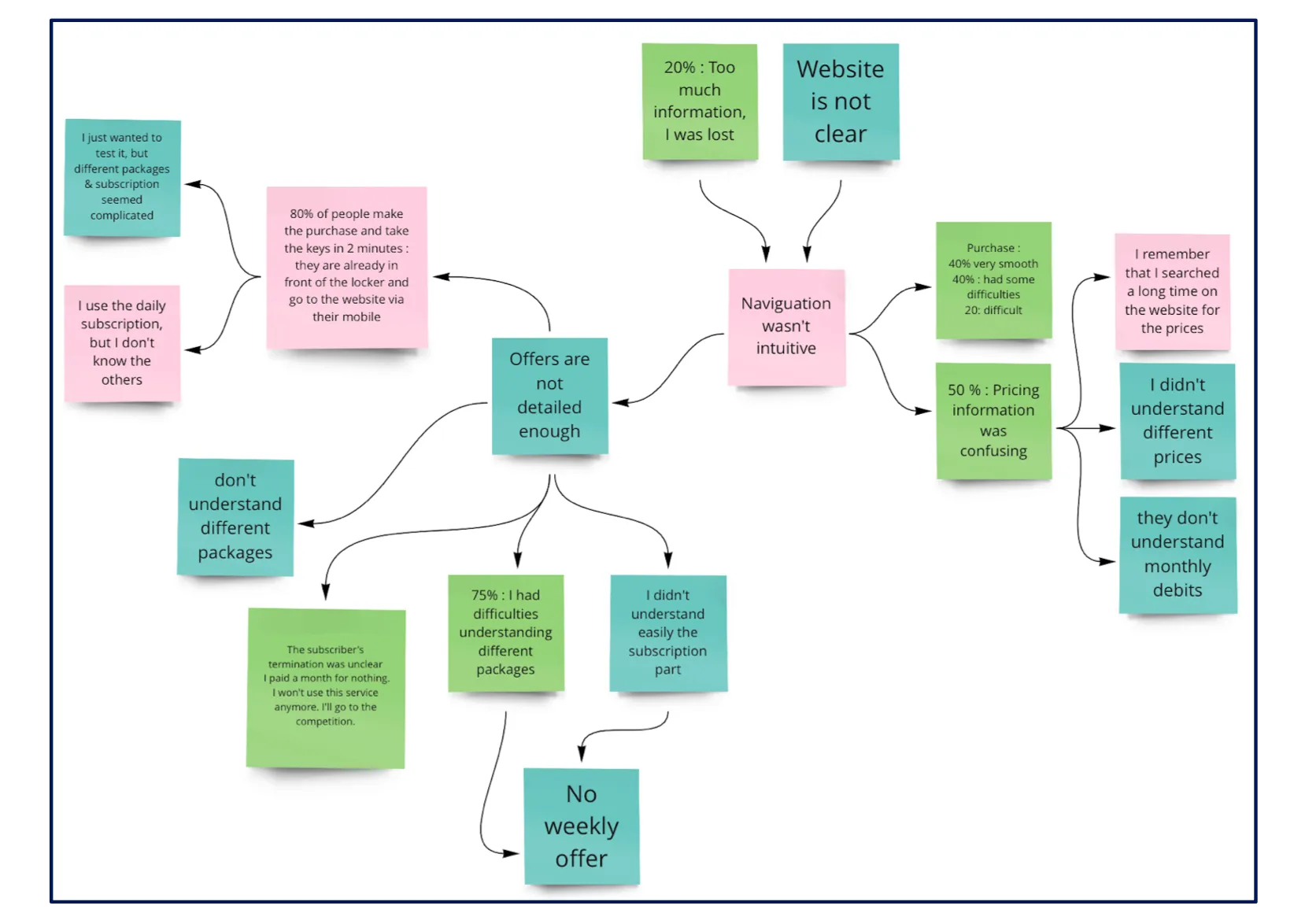
Using all the previous data, we decided to employ the Mind Mapping methodology to figure out the root of the problem. Mind Mapping is a visual representation technique that facilitates the exploration and connection of diverse ideas and factors associated with a specific issue. This method helps create a clear picture of how things are connected, making it easier to understand and solve the main causes of the problem.
Mind Mapping
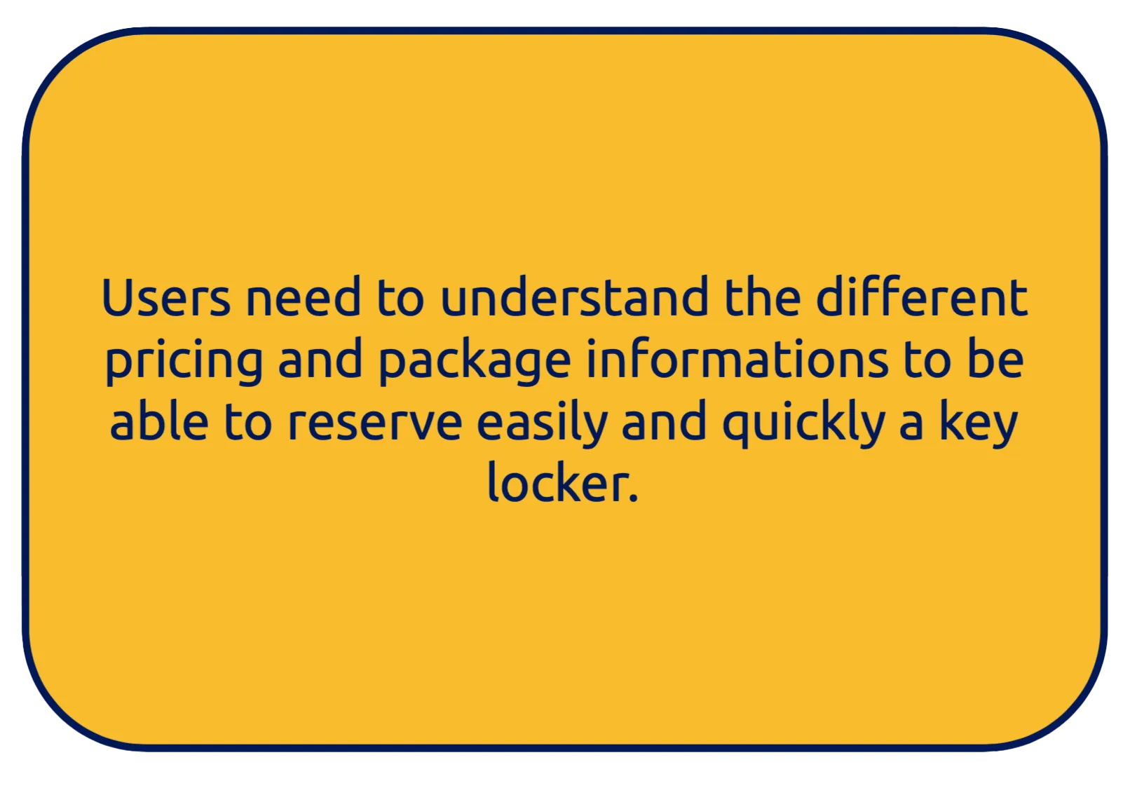
This methodology led us to define the problem statement:
Problem statement
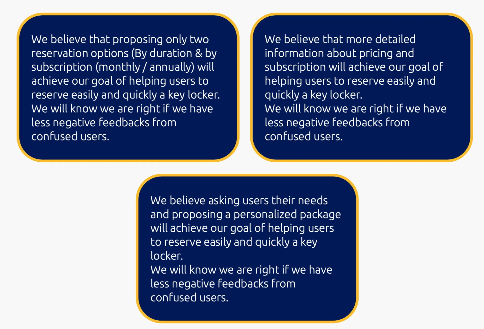
As the main problem consists of unclear information on the website, we came up with three hypothesis statements:
Hypothesis statements
The main problem statement and three hypothesis statements set, it was time for us to define the user persona and his journey map.
So, let’s meet Hodophile Hugo. He’s a 38-year-old teacher living in Paris. As a teacher, he has long summer vacations during which he visits other countries. While he’s away, he rents his apartment to other travelers.
Persona
The last time he went on vacation, he chose Monkey Locky as a secure way to hand over his apartment keys to his tenants. He subscribed and reserved a locker for two months. Until then, everything was fine. But six months later, while he was checking his bank account, he noticed monthly payments from Monkey Locky even though his reservation was already over. He felt so frustrated about it and decided not to use the service again.
User Journey map (As Is)
Finally, as we wanted the user’s needs to be even more transparent, we wrote several user stories from the perspective of the end-users.
User stories
Ideate
Before brainstorming about the new design of the website, we decided to examine its current version by conducting a site audit.
We noticed that the amount of information and how it was presented on the homepage led to confusion. There was much inconsistent information and also some broken links.
Site audit
For better consistency, we decided to review the site map, rename some of the existing pages and combine the pages that had related content. So, we came up with this new site map:
Site map
In terms of the user flow, we chose to concentrate on the monthly subscription, as this is where many users seem to face confusion and lack a clear understanding.
User flow
It was finally time for us to start sketching different pages and put all our ideas on paper.
Wireframe sketch
We also decided to pay more attention to choosing the right and more exact words while explaining different packages and pricing.
And finally, we proposed to our client to send an email to the users after the end of each long reservation to remind them of the ongoing subscription and the monthly payments.
Mid-Fi prototype & test
We used Figma to build our Mid-Fi prototype. As for the Homepage, we aimed for clarity. Therefore, we decided to relocate unnecessary information to other pages and created separate sections for important content. Concerning the reservation page, we organized each step in a systematic manner to guide the user seamlessly from the beginning to the end.
Mid-Fi prototype
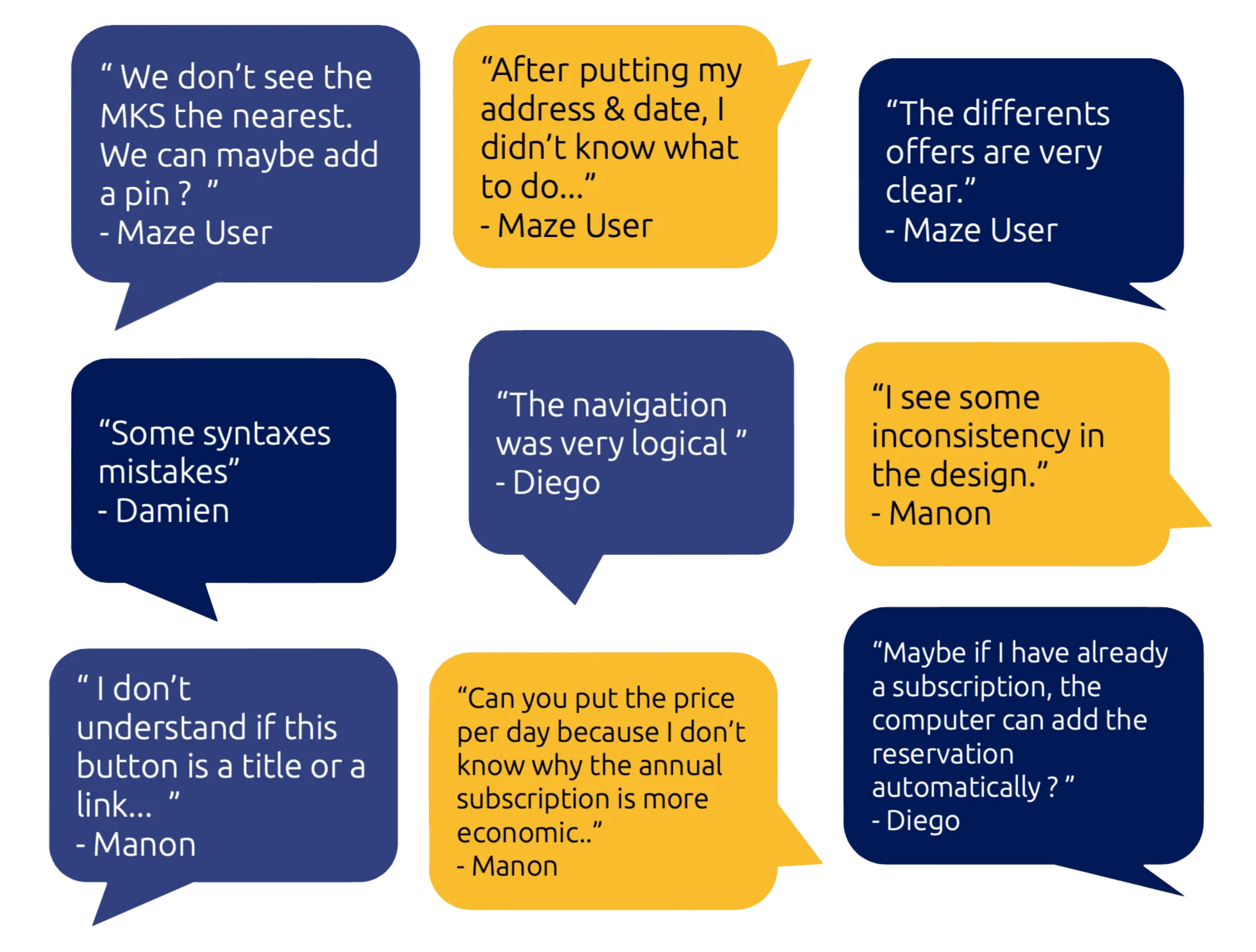
We conducted a usability test on our Mid-Fi prototype with some users and our client and took their feedback into account to improve our Mid-Fi prototype.
Usability test
Visual design
We decided to take a closer look at how Monkey Locky looks (like its colors and design) and see if we can make it even better. We wanted to give it a fresh and improved style to make it more appealing and user-friendly.
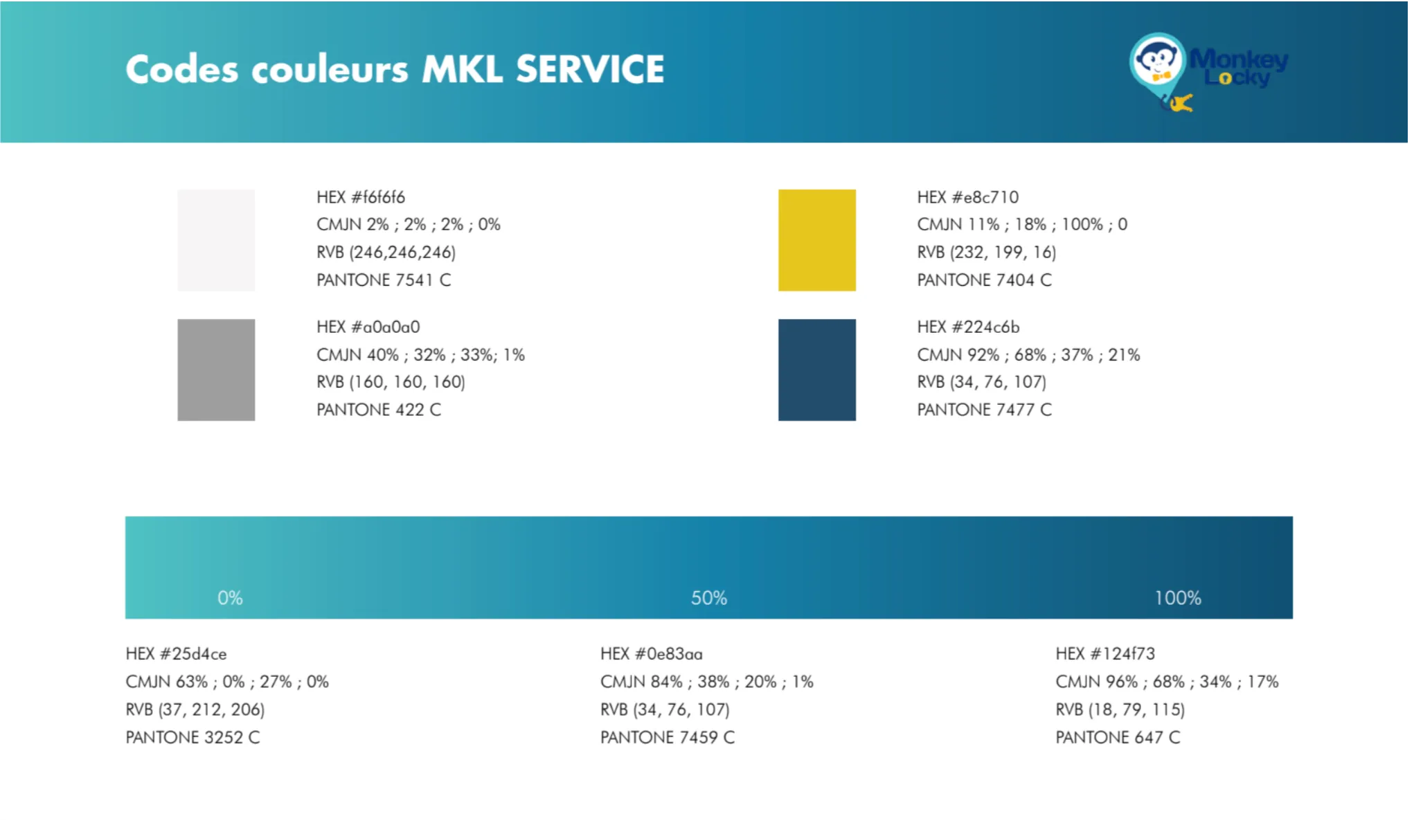
Existing Style tile
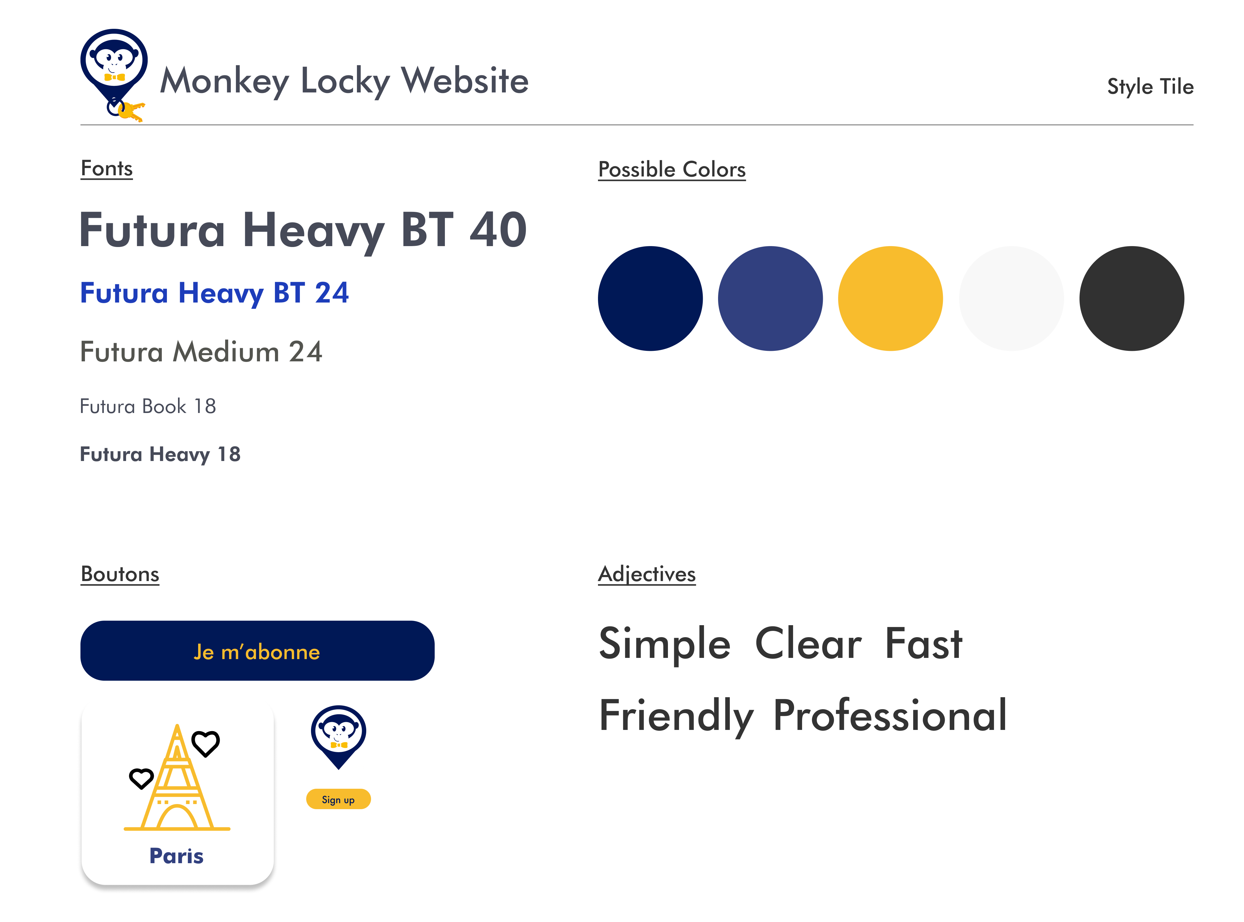
After checking out various mood boards and taking in account the Monkey Locky's brand adjectives, we decided to stick with blue and yellow as the main colors. However, we're making some adjustments to their shades for a refreshed look.
Proposed Style tile
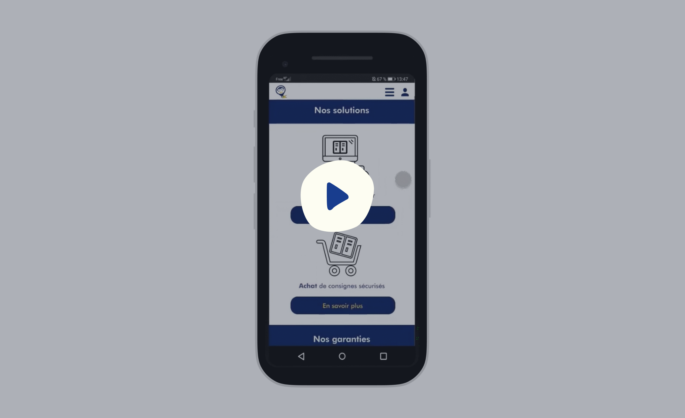
Hi-Fi prototype
Below you can see the final version of Monkey Locky’s website design:
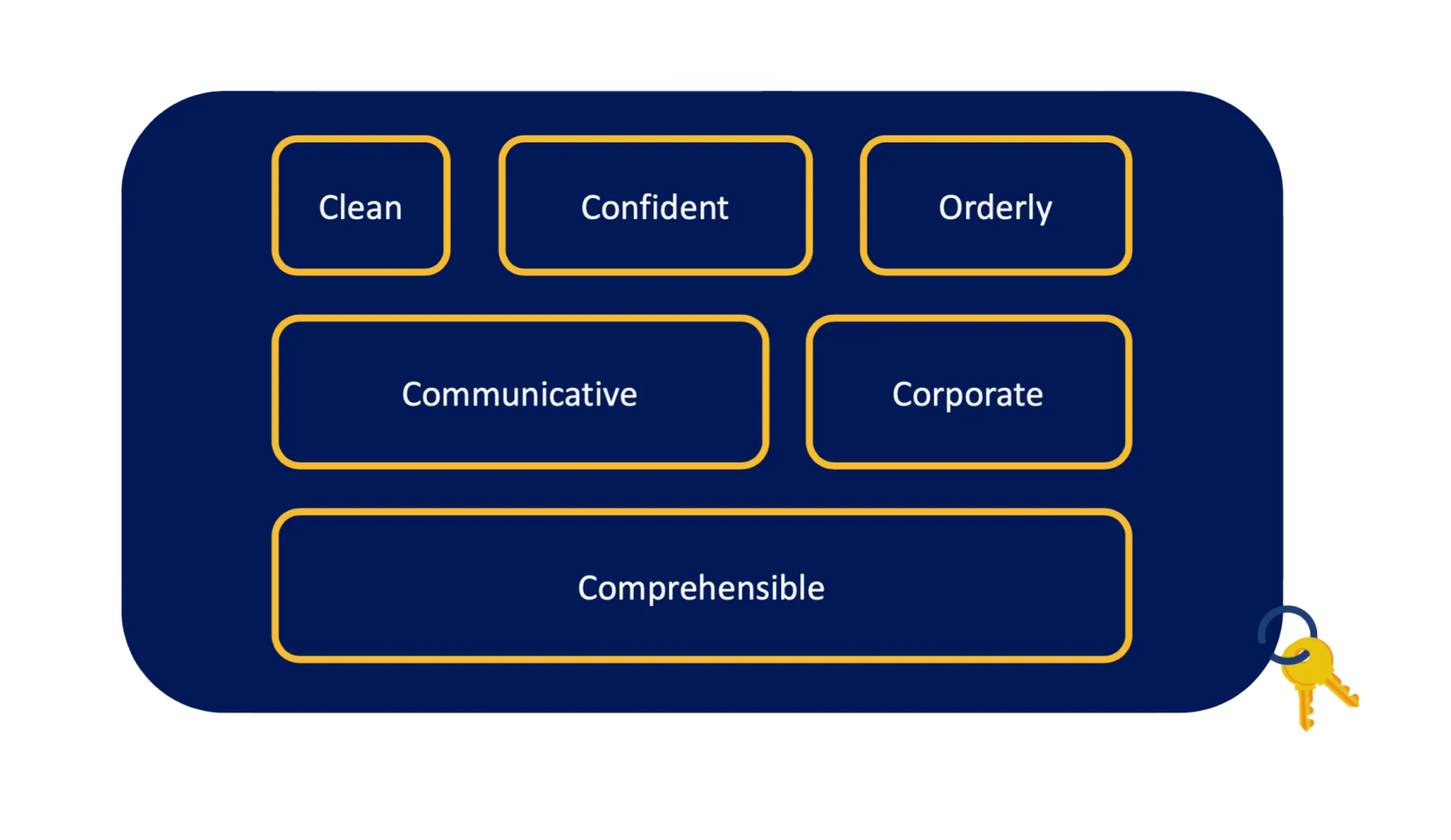
Finally, we did a desirability test on our Hi-Fi prototype to validate our choice of colors and understand users feelings about our design. Most of them said that they find the website clean and orderly… And that matches Monkey Locky’s brand adjectives!
Desirability test
Conclusion
This final project proved to be an engaging and challenging endeavor, providing a valuable opportunity to address a real-world problem for an actual client.
The application of the Design Thinking methodology was a notable aspect of this project, emphasizing the importance of user involvement throughout the entire design process. This approach ensured that our solutions were not only technically sound but also deeply aligned with the specific needs and preferences of the end-users.
We were also fortunate to collaborate with Monkey Locky, our client. Their consistent and constructive support throughout the two-week project significantly contributed to its success. This professional engagement not only allowed us to apply theoretical knowledge in a practical context but also served as an enriching experience, preparing us for future client challenges.